 |
Introduction Site Map Main Project Email: jja@nac.net |

— Brian Aldiss


Thursday, March 2nd, 2006
This entry will cover the evolution of a logo that I designed for a side project of mine, hexmaps.com. Thanks to Laura for her many valuable comments as I did this work.
First we have two pedestrian attempts to include hexagons in the logo without desiging entirely new letterforms. (The font shown is Franklin Gothic Book.)
![]()
![]()
![]()
I then decided that I should try to create letters based on hexes; here's my first try at that. The red figure on the right is the skeleton from which the letters were constructed. The letters 'X' and 'M' presented the greatest difficulty.

The letters looked too spindly, so my next try altered the 'X' to one of Laura's design, and filled in the valleys with partial hexagons, separated by white lines to suggest a grid. A variant 'A' is at far right.

I didn't like how these letters were turning out, so I started afresh and developed another way to create letterforms from hexes. (Variant letters are again at right). I then made some lowercase letters for the 'dot com', and realized that they looked much cleaner and simpler than the other letters...

So I redid everything, using single hexagons as the base skeleton for the letters, and I knew then that I was on the right track. Laura suggested continuing the points of the verticals to make their ends horizontal, but doing so made the gaps between the verticals too narrow. Also, they still looked a bit too much like Space Invaders...
![]()
The solution was to make the letters thinner. Below is the final version:
![]()
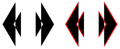
As an aside, as I developed the 'H' in the next to last version, I came across an accidental bit of art - the doubled arrows shown below. The right hand side shows the lines that make up the object, and which are to form the verticals of the 'H'. It takes this form because Illustrator is trying to complete the fill across the gap in the bounding lines of the object; the effect disappeared when I joined the points at the tops and bottoms.

That's all for this week. Until!


pageatatime.com is hosted by net access corporation - www.nac.net