 |
Introduction Site Map Main Project Email: jja@nac.net |

— Stanislaw Lem, Solaris


Monday, March 14th, 2005
Update Monday evening...
Update: Today, I'm continuing my previous entry from March 3rd wherein I describe the process I'm using to color the fan art for Something Positive. I previously described how I'm tracing the flat areas of color in Illustrator, and using Photoshop's color picker to get the color values from an actual SP strip. (If you use Mozilla or Firefox as a web browser, you can install the Colorzilla extension to read RGB color values right from a webpage.) In this entry, I'll explain how I'm creating the solid black lines that will give the piece a finished, 'inked' appearance. It's just a bit more involved than it may sound.
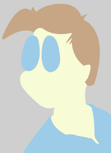 |
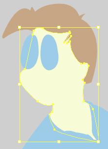
The image to the left shows the character of Davan after I've drawn the flat colored areas. To the right is the shape of his face and neck, selected in Illustrator. Note that the shape underlaps the shape representing his shirt, but that it shares an edge with the hair shape. This represents indecision on my part on how to proceed... Having the shapes fit together like jigsaw puzzle pieces is neater in a sense, but it's also susceptible to error if the pieces don't abut each other exactly. On the other hand, it doesn't matter whether one shape is on top of the other. In the end, I decided it was quicker to use the over/underlap method, as I don't have to copy the joining edges. Seeing the pure forms of Davan's head laid out in this manner, without the lines that create the illusion of a face, gave me a new appreciation of how elegantly Randy Milholland has developed the iconography of his characters. Even when filtered through my own redrawing, the forms stand on their own merit, balanced and serene. |
 |
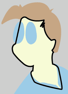 |
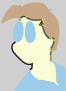
On to illusions. To the left, I've copied the face object, pasted it in front, and made the fill transparent while applying a black stroke. Why not just give the face object a black stroke, and thereby use only one object for the fill and the inked line? Because Illustrator doesn't permit me to stroke one segment of a line and leave another segment blank. (I can create a dashed line, but it wouldn't provide the right effect.) Note the line crossing Davan's glasses - I can bring the glasses object forwards to conceal that line, but I'd still have to extend the line at his chin in order to complete his face. (This may become clearer if you compare his chin at this stage to his chin in the final images at bottom.) To the left, I've deleted some sections of the outline, dividing it into several objects. I had to add some anchor points to the line to get it to end where Davan's glasses begin. The highlighted line along Davan's hairline is shortly to be deleted, as I'm going to use an outline of Davan's hair to make that line. |
 |
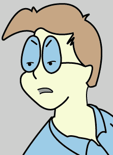 |
To the left is Davan with his facial features delineated; compare with an overlay of the original pencil lines to the right. Notice that I've made his hair a bit thicker at the top than I had it in my original sketch. Changes such as this are very easy to perform in Illustrator, where I can select and move a few points of an object and leave the other points untouched. This sort of distortion would have been harder to achieve if I had done the flats in Photoshop, not to mention what a pain it would be if I had drawn this all on paper. I'm glad that I live in 'interesting times' such as these, where enhanced tools permit the expression of one's craft while eliminating paste ups, white out, rubber cement and other drudgeries. I am quite lazy at heart.... | 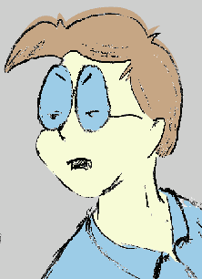 |
I don't expect to have the piece done this week, as I'm still doing paperwork... I expect that the next entry will be rather short. After this coming weekend, I should have much more time and less stress. Until!


pageatatime.com is hosted by net access corporation - www.nac.net